


***Caveat to this note upfront is that this piece is not meant to, nor does it support, a view on any upcoming IPO lockup dynamics. Every situation is different and past is not present.
The typical lockup is 180 days after IPO allowing private shareholders, executives the opportunity to monetize. Everyone knows the date, and it sits in the prospectus months ahead. The lead up to these events serve as a well-known opportunity for long and short investors to position ahead of the feared supply that will swamp demand on the days that follow lockup expiry.
So, I went to check whether that actually happens. My last piece, Nine in Ten IPOs Break, found that most of an IPO’s damage lands in the first few months. That is well before the lockup opens. This is the follow-up, and it puts the lockup itself under a microscope.
I pulled 19 of the most recognizable IPOs of the past fifteen years, and ran a study of the period around each one’s 180-day unlock. Every figure here is market-adjusted, meaning the stock’s return minus the S&P 500 over the same days. A falling market
never gets counted as a lockup effect. Day 0 is the first trading day at or after 180 calendar days from listing. Direct listings sit out, since going public without underwriters means there is no lockup at all. Coinbase, Palantir, and Roblox are therefore excluded.
Here is the short version. The dip everyone waits for has already happened by the time the lockup arrives. The unlock day itself is a volume event with a small price notch. The two largest insider floods in the sample did not crater their stocks. They rallied them.
The fade shows up before the unlock
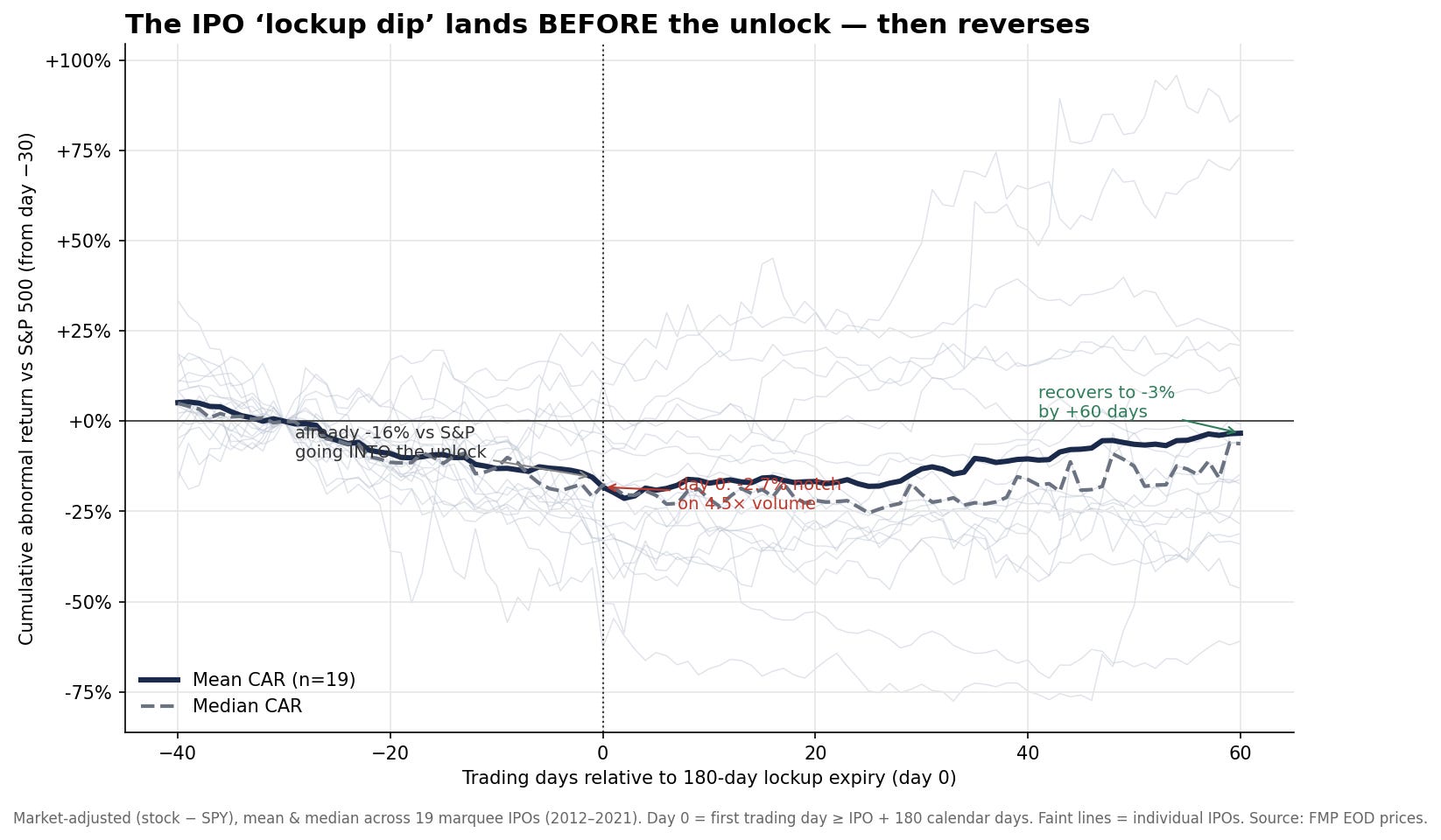
The dip is mostly over by the time insiders can sell. Stack all 19 names on the same clock and the shape is plain. The average IPO walks into its unlock already down about 15% against the market over the prior 30 trading days. The median is worse, at down 21%. By the time insiders can legally sell, the selling is nearly done.
Some of that slide is ordinary post-IPO drift. These are expensive stocks. The quiet period ends, when the company and its bankers stop promoting the stock, and the first earnings misses land. Some of the slide is the market front-running a date it can see coming. I will not claim the lockup causes the whole 15%. But the direction is clear, and it runs opposite to the folk model. The weakness comes before the event.
Volume is the only thing you can count on
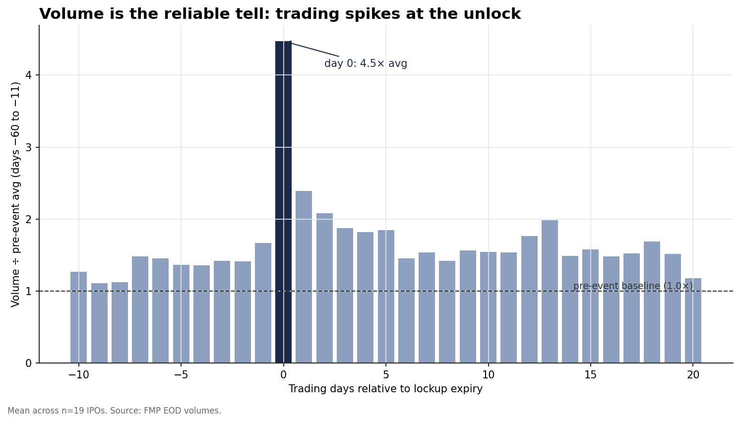
The one dependable feature of an unlock is a jump in volume. On the day itself, volume explodes. The mean is 4.5× normal, and the median is 3×. Every marquee name in the sample lit up. Twitter traded 11×. Uber traded 15×. The float, meaning the shares actually available to trade, multiplies overnight, and the tape shows it at once.
The price move is a different animal. The unlock day is usually a small down-notch. 15 of the 19 names fell against the market. But the average was only −2.7%, and it does not stick. Volume tells you the event happened. It tells you almost nothing about direction.
The reaction is an average, not a rule
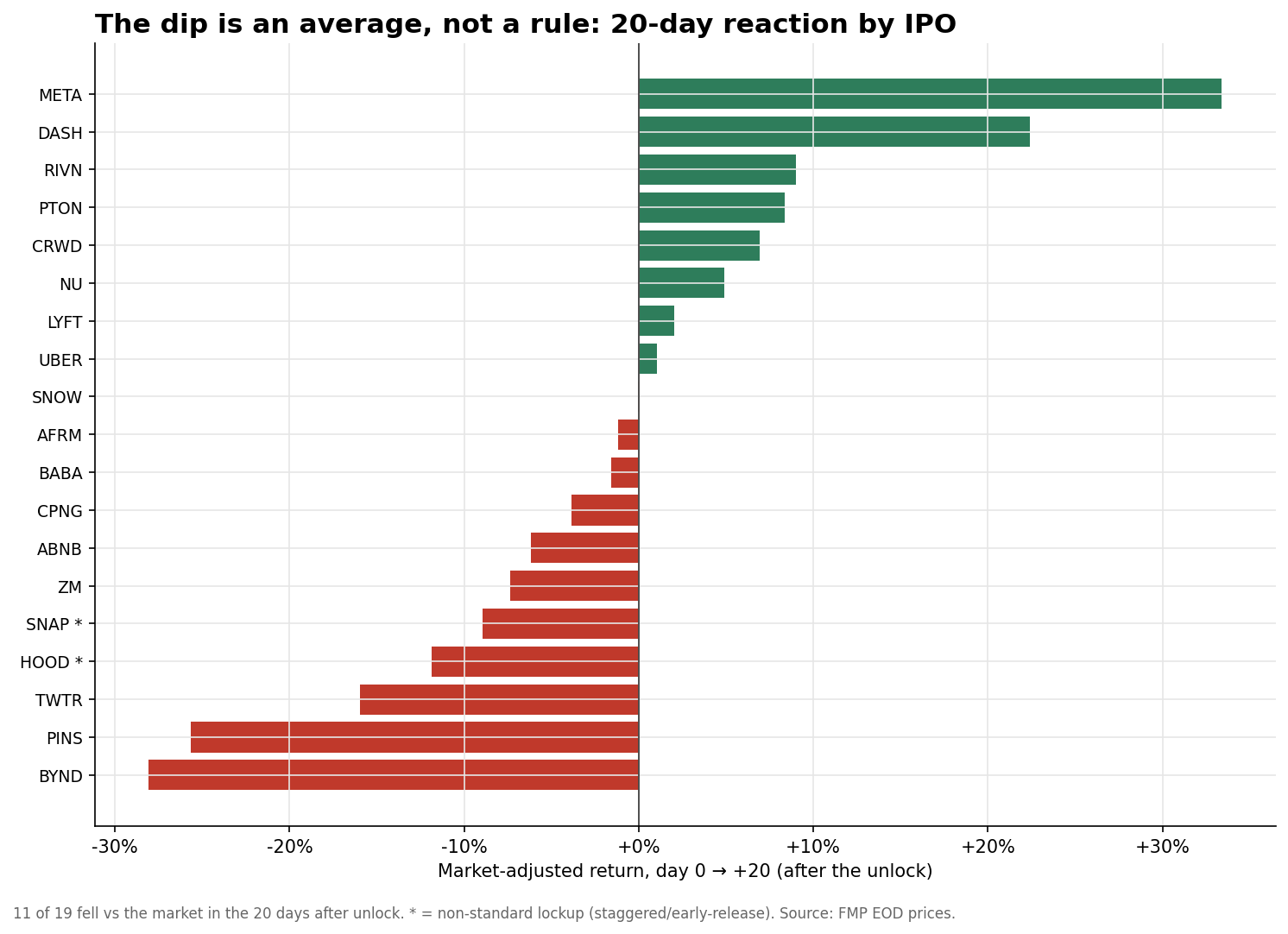
The base rate dissolves the moment you look at the names. The 20-day reaction runs from Beyond Meat at −28% to Facebook at +33%. Just over half the sample was negative. The rest rose, some of them sharply. This is not something you can trade blind on any single name. It is a faint tilt buried inside huge dispersion.
The worst-behaved cohort is the one you would guess. The 2019 profitless-unicorn class averaged −5% on the day, on roughly 7× volume. Uber, Lyft, Pinterest, and Peloton led it. The three names that barely flinched arrived at their IPO already profitable, namely Alibaba, Zoom, and Facebook. That is the same fault line my last piece found across the whole asset class.
The biggest single unlocks rallied

The largest single unlocks in the data went up, not down. The cleanest test sits inside two stocks that released their shares in stages.
Facebook spread its release across five dates. The reactions ran the full range. Down 7% on the 90-day tranche. Almost nothing on the 150-day. Then up 14% on the 180-day unlock, which freed 777 million shares. That was the single largest block of the whole schedule. The biggest flood of insider stock in the sample produced a rally.
The +19% pop a few days earlier was Facebook’s Q3 earnings, not a lockup. The two get conflated constantly, and they are not the same thing.
Snap tells it in miniature. Its first unlock freed 400 million shares to early investors. The stock had already bled 22% into the date, and it slipped about 1%. Then came the big one. 782 million employee shares, freed four days after a poor earnings report. That is the exact setup the fear model says should be catastrophic. The stock rose 5.5%.
The mechanism is not mysterious. By the time the flood everyone circled finally arrives, it is the most anticipated seller in the market. The overhang that pressed on the stock for weeks clears. The last buyer of downside protection is done. It is sell the rumor and buy the news, expressed in share count.
The size of the flood is irrelevant
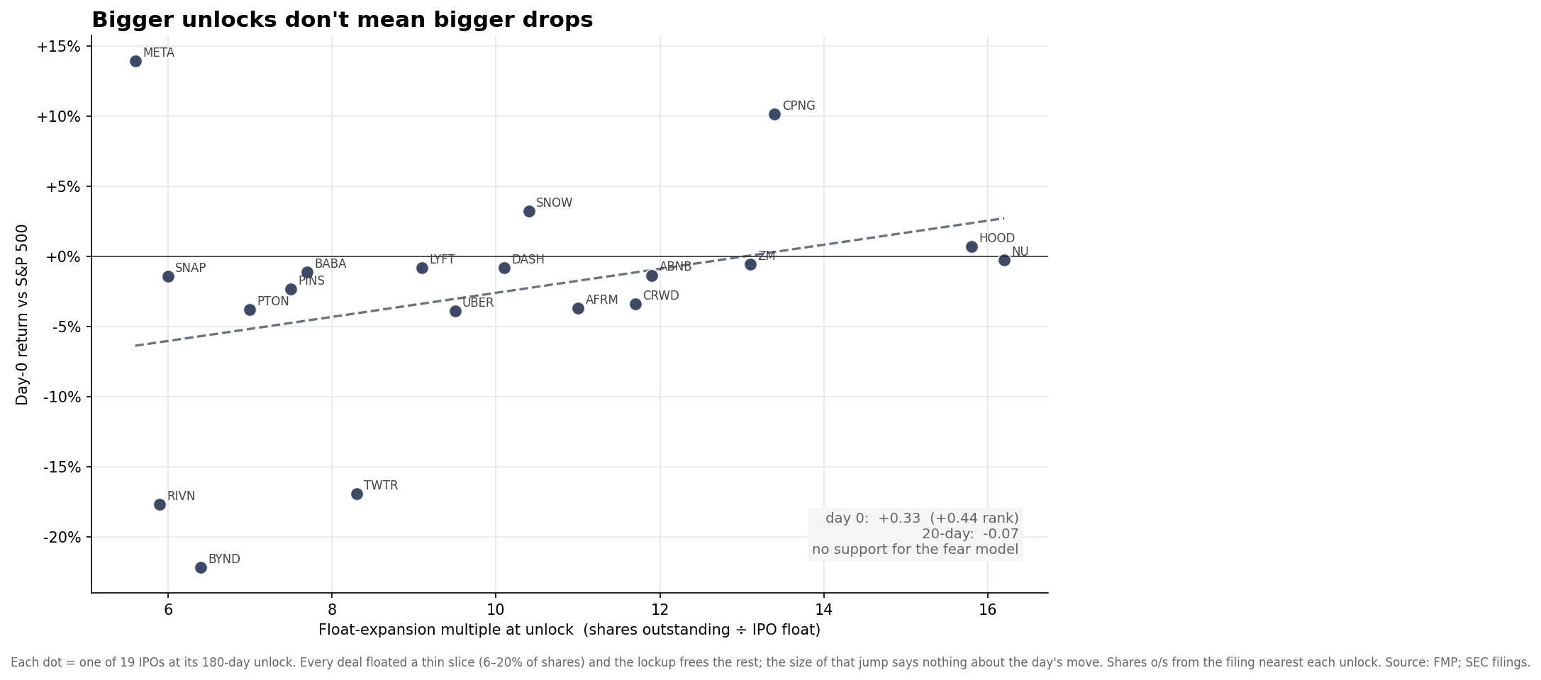
The size of an unlock does not predict the reaction. If the fear model were right, the deals that free the most stock should fall hardest, and they do not. Initial float across the 19 names clustered in a thin band. The median was around 10% of shares outstanding, with none above 20%. So the lockup takes each stock from a sliver of tradeable float to nearly all of it. That is a float expansion of roughly 6× to 16× overnight.
The expansion has no reliable link to the reaction. The rank correlation is near zero over the 20 days after the unlock. On the day itself the faint tilt runs backwards, with bigger expansions posting slightly better days. The two largest single-session releases settle it without a regression. Facebook freed 36% of its shares in one day, and Snap freed 67%. Both rose. What sets the reaction is not how much stock unlocks. It is whether the market saw it coming, and with the date in the prospectus for months, it always does.
Robinhood shows where the cliff went
The clean 180-day cliff is disappearing, and Robinhood is the tell. Its lockup was a patchwork of early releases. A slug of shares became sellable under Rule 144 from the 91st day. Rule 144 is the SEC rule that lets holders sell restricted stock after a set holding period. Price-based triggers freed more, and the nominal 180-day date sat underneath it all.
By the time that date arrived in late January 2022, it was a non-event. Volume ran 1.1× normal. The float had already been let out in pieces, and the stock had already fallen by roughly two-thirds on its own merits. Robinhood’s worst day in the window was not a lockup at all. It was the −10% reaction to Q3 earnings.
More deals now write in these staggered, performance-based releases. The single date you could once circle is turning into a smear. If you still trade the lockup, use the date where the shares actually move. The volume spike will tell you, and often it is nowhere near the 180-day mark.
The folk trade runs backwards
The intuitive lockup trade is backwards. The obvious version is to wait for the lockup and short the flood, and it points the wrong way. The fade is a pre-event, not a post-event. By the day the shares unlock, the crowd has already shorted it, and the overhang is already in the price.
The evidence says the stock is closer to a local bottom than to a fresh leg down. Across the sample, the average name is at its worst the day after the unlock. Then it grinds back to roughly flat against the market within 60 trading days.
If there is an edge near the event, it is the mirror of the folk trade. It is the weakness into the print, not out of it. But the same wall from my last piece applies here, and harder. Borrow on a fresh IPO is scarce and expensive. It gets cheap only once the lockup floods the float, and by then the move is over.
Options are the cleaner vehicle, but implied volatility around these dates is brutal. The pattern is real, but the tradeable version is small. It lives in careful timing and instrument selection. That gap is probably why it survives.
Caveats
This is 19 hand-picked marquee names, not the full universe. They are the famous, heavily analyzed deals with the loudest lockup coverage. That is deliberate. It also bakes in survivorship and selection, and the small-cap tail behaves worse. Returns are market-adjusted with a beta of one, not a fitted factor model.
The 180-day mark is a convention. I use each stock’s first trading day at or after IPO plus 180 calendar days. For the two names with staggered or early-release structures, Snap and Robinhood, that date misses the real unlock. That is why their day-0 volume is flat. The “down 15% into the event” figure blends real pre-positioning with ordinary post-IPO drift, so it should not be read as pure lockup anticipation. LinkedIn belonged in the sample but was dropped, since clean split-adjusted history for it no longer exists after its acquisition.
What I take from this
The lockup is a supply event the market prices in advance. The damage lands in the weeks before, not the day of. If you wait for the unlock to tell you something, you are quite possibly reading yesterday’s news.
Volume is the signal, and price is noise. Every unlock spikes volume. The direction of the day is a small, mostly-down flicker that fades within weeks.
The size of the flood is not the risk. The two largest insider unlocks in the sample both rallied. Across all 19 names, the float-expansion multiple has no bearing on the move. A fully anticipated seller clearing the overhang is a bottoming mechanism, not a crash.
Check the date, not the calendar. Early-release and staggered structures have moved the real unlock off the 180-day mark. Follow the volume, not the six-month rule of thumb.
The lockup is not where IPOs break. It is where the market finishes pricing a break it saw coming months earlier. And often enough, it is where the selling finally ends.
19 marquee US IPOs from 2012 to 2021, with daily prices from Financial Modeling Prep. Event study around each name’s 180-day lockup expiration, defined as the first trading day at or after IPO plus 180 calendar days. Returns are market-adjusted against the S&P 500. Staggered-tranche dates for Facebook and Snap, and the Robinhood early-release timeline, come from contemporaneous reporting and SEC filings. Per-tranche volume uses a trailing 20-day median. Unlock magnitude compares each deal’s base offering size, excluding the greenshoe, to shares outstanding from the quarterly filing nearest each unlock. The greenshoe is the underwriters’ option to sell up to about 15% more shares. Direct listings are excluded. None of this is investment advice. It is a base-rate study. See here for Disclosures & Disclaimers.