


Every IPO cycle the same movie plays. A company prices at $30, opens at $42, everyone posts about the pop, and six months later the stock is $22. But when I went looking for hard numbers on it, how often it happens, how deep it goes, how long it lasts, I found the research oddly incomplete. Academics have studied the first day pop to death. Jay Ritter has forty years of data on underpricing, and the long run underperformance of IPOs as a group is well documented. Practitioners occasionally publish small samples. Truist looked at 30 famous mega cap IPOs and found an average first year drawdown of 55%. But nobody had mapped the full price path, pop then peak then purge then maybe recovery, across the whole universe.
So I had Fable build it. Roughly 3,000 US operating company IPOs from 2010 through mid 2026, assembled from Ritter’s IPO database, IPOScoop’s offer price records, and SEC prospectus filings. SPACs, closed end funds, and ETF listings are stripped out. After requiring a valid offer price of at least $4 and a clean daily price history from listing day forward, the core sample is about 1,700 IPOs. Of those, 1,638 also have financial statements from around the time of listing.
The typical IPO loses money
Index every IPO to its offer price, so offer equals 100, and stack all the price paths on top of each other. The median IPO closes day one around 106. It drifts up for a few weeks, tops out, and then bleeds. By the end of year one the median IPO trades below its offer price. By the end of year two it sits around 87 and is still falling.
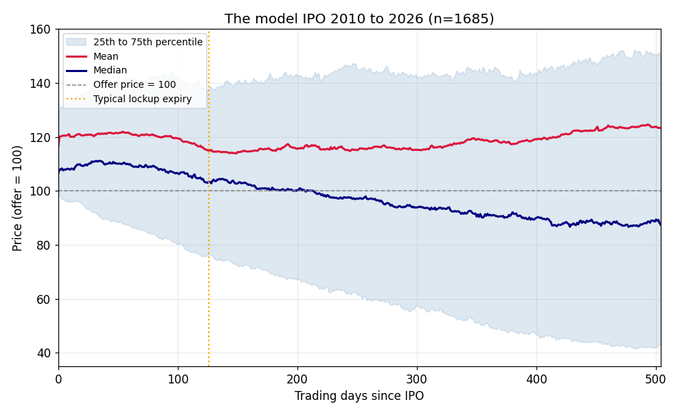
The mean tells a completely different story. It stays above par and grinds higher the whole time. That gap between mean and median is the entire IPO asset class in one chart. The average gets rescued by a small right tail of enormous winners while the typical name in the group is a losing investment from the first print. Buy every IPO at the day one close and your results depend almost entirely on whether you caught the handful of Airbnbs (priced at $68, peaked at $220, then chopped between $80 and $160 for ~5 years).
A few base rates from the sample are worth having in your head. The median day one pop is 6.5%. The mean is 17%, dragged up by the tail. And about 29% of IPOs close their first day below the offer price. The pop is not a law of nature. It is a coin flip with a mild upward tilt.
The early peak comes fast. Looking at the first 60 trading days, the median IPO tops out around trading day 24, roughly a month after listing. About one in five IPOs peaks within the first three days, meaning the pop was the top.
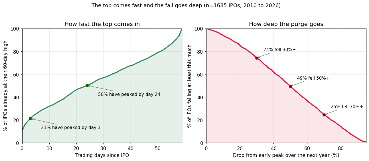
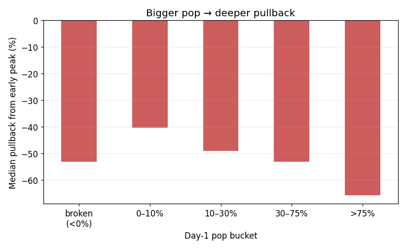
Then comes the purge. Measured from that early peak, the median maximum drawdown over the following year is 50%. The 25th percentile is 70%. This is not a mega cap thing or a busted small cap thing. It is the base rate for the asset class, and it sits right in the range Truist found on their 30 famous names.
More than 90% trade below their offer price at some point, and the median first breach happens around trading day 31, about six weeks in, after the quiet period ends and well before the lockup opens.
Who comes back
Since breaching the offer price is nearly universal, the interesting question is how long stocks stay under. Most breaches are brief. A stock hovering near its offer dips below and pops back within days. But there is a thick, stubborn tail. I ran the recovery question through survival analysis, treating delistings both as censored observations and as permanent failures, and the two versions barely differ. About 15% of breachers are still below their offer price a full year after first going under. Roughly 10% are still under three years later. Once a name settles into that tail, delisting becomes a common exit. About 40% of the full sample no longer trades today.
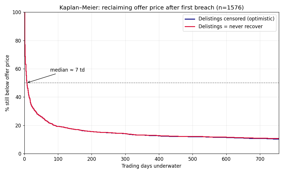
Only about six in ten IPOs ever get back to their early peak, and the ones that do often take the better part of a year.
One accounting flag splits the whole market
At the time of listing, only 38% of these companies had positive net income and only 51% had positive EBITDA in their latest fiscal year before the offering. Split every path metric by that one flag and you get two different asset classes.
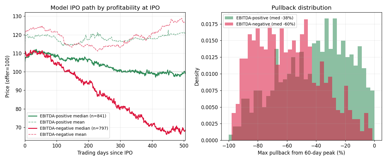
The EBITDA positive group pulls back a median of 38% from its early peak. Its median price path hovers around par, 103 at one year and 99 at two. Two thirds of these names eventually reclaim their early peak. These stocks mean revert.
The EBITDA negative group pulls back a median of 60%. The median path sits at 88 after one year and 68 after two, still declining. Nearly half are delisted today.
And the part that should bother you. The unprofitable names pop harder on day one, a median of 8.7% versus 5.5% for the profitable ones. The market pays its biggest opening premium to exactly the cohort with the worst subsequent outcomes. Story stocks pop on story. Then the quiet period ends, the lockup expires, the cash burn continues, and gravity does the rest. As far as I can tell, essentially the entire famous long run IPO underperformance result lives inside the unprofitable half of the market.
Two refinements on this.
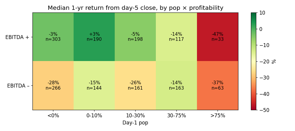
First, pop size interacts with profitability until it stops mattering. Profitability protects you in every pop bucket except the biggest one. A modestly popping profitable IPO, up 0 to 10% on day one with positive EBITDA, behaves like a normal stock, with a median one year forward return from the day five close of about plus 3%. But IPOs that popped more than 75% were toxic no matter what the financials said. Median one year forward returns were minus 37% for the unprofitable ones and minus 47% for the profitable ones, though that last cell is small. A giant pop is not a quality signal. It is a supply and demand dislocation that gets corrected over the following year, usually violently.
Second, growth partially redeems cash burn. Among the EBITDA negative names, the top quartile of revenue growers, with growth above roughly 80% and a median near 170, showed much better forward returns, roughly minus 12% over the next year versus minus 30 for the slower growers, along with lower delisting rates. The true kill zone is the slow growing money loser. Burning cash while growing less than about 20% carried a median pullback of 64% and about half of those names are gone. Burning cash while hypergrowing is a gamble. Burning cash while growing slowly is a diagnosis. VC backing, for what it is worth, mostly proxies this same split, since 79% of VC backed IPOs came public without positive EBITDA.
The uncomfortable trade
Put the pieces together and a systematic pattern falls out that is almost embarrassing in its simplicity. Short the unprofitable IPOs after the early peak. Entering short at the day 20 close and covering six months later produced a median gain to the short of about 16% with a 63% hit rate across 800 EBITDA negative IPOs. Waiting until day 40 or 60 does slightly better still. Run the same trade on the profitable cohort and you get about 2%, which is no edge at all. The whole anomaly is concentrated in the cash burners.
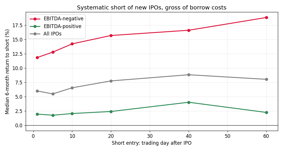
Before anyone runs off to build this, those numbers are gross of borrow costs, and borrow is exactly where the market defends itself. There is no rule stopping you from shorting a new listing. You can short the moment your broker locates shares. The problem is that shares barely exist to borrow at first. IPO stock has not settled, lendable float is tiny, and fees on fresh deals routinely run to triple digits annualized. In practice, borrow becomes possible within the first week on larger deals, tolerable over the first month, and cheap only after the lockup expiration floods the float about six months in, by which point much of the fade has already happened. Options usually start listing about a week after the IPO and are often the cleaner early vehicle, though implied vol on fresh IPOs is brutal and eats a good share of the expected fade. The edge in the data is real. The implementable edge is smaller and lives in careful instrument selection. That gap, where everyone can see the pattern but few can cheaply trade it, is probably why the pattern survives.
Caveats on base rates
Prices are split adjusted, and I cross checked day one closes against contemporaneous records to catch adjustment mismatches. About a fifth of names needed correction, mostly reverse split casualties. Names with unrecoverable price history, which skew heavily toward fast failures, are missing entirely, so if anything these numbers flatter the asset class. Fundamentals use the fiscal year closest to listing, which for some names is the first post IPO year. Companies that changed tickers along the way, which usually means they were acquired or rebranded, drop out of the sample, and since acquisitions skew toward good outcomes this cuts mildly against the recovery numbers. Offer price records also thin out after 2020, so a handful of famous recent listings like Reddit, Arm, and Cava sit outside the offer price sample even though their price paths check out fine. Direct listings were never in scope since they have no offer price at all. Recent IPOs have not had time to complete their arc. And the 2020 and 2021 vintage, where 60% of IPOs were unprofitable and median pullbacks hit 66%, weighs heavily on the worst cells. The pattern shows up in every era but the magnitudes move with the cycle.
What I take from this
If you like an IPO, plan around a better than 90% chance it trades below its offer price at some point, most likely one to three months after listing. The best time to buy something you believe in is rarely week one. The supply calendar and the data both argue for patience measured in months, not days.
One accounting flag, positive EBITDA at listing, separates stocks that mean revert from stocks that melt. It is the cheapest quality screen in the market and almost nobody applies it to new issues.
And if a deal doubles on day one, that is a reason for caution rather than celebration. The biggest pops had the worst year one outcomes even among profitable companies.
The IPO market is not mysterious. It sells stories at peak enthusiasm into constrained supply, then delivers the shares, and the truth, on a six to twelve month delay.
Data covers roughly 3,000 US operating company IPOs from 2010 to 2026, built from Ritter’s IPO database, IPOScoop, and SEC filings, with daily prices from FMP and Yahoo. The core sample with financials is 1,638 names. None of this is investment advice. It is a base rate study, and base rates are where the bodies are buried.
Great article!
My last was actually on the exact same topic, funny enough also quoted Professor Ritter.
One important addition is that if you get in at the initial listing price, you actually outperform the market long term - problem is retail mostly don't get allocations!
Very much enjoyed and thank you!